| Notes on the Process
2 layers
a mail conversation between Karyn (sender of images) + Dorothee (assembler of pages)
*
Dorothee
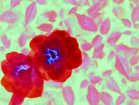
i now tried the flower image -
and while at it, i also placed the text with an image that is less obviously related to pink, but more related to diary: the black/white one i like the fields, the patterns they form, and the details on it like an unmarked calendar. have a look, i included it as second screenshot.
or maybe you have another image that you think might work?
and again, interesting to see how a different image gives a different tune to the text.
*
Karyn
first ... the two images really do highlight different aspects of the words ... i think they are both interesting fits'.
the flower and leaf image seems to say, right away: 1940's and 1950's; traditional gender roles and gender expectations, especially as they relate to norms of femininity; it reminds me of the doilies and napkins of my grandmothers' era. it seems to speak of what the writer resists / rebels against in part of the story, and the bold red flowers speak to the fire within her ...
the black/white image also speaks to different gender boxes: masculinity and femininity. white = femininity / the virginal female; black = masculinity / the johnny cash, james dean bad boy. the writer is challenging these boxes, and in the process, staining the white boxes blue and red.
as for other images, gosh ... one comes to mind right away, originally published a while back in referential magazine, and one that picks up on the color reference in the author's words: red white blue'
note the pink in there, up in the top right corner (overpowered by the raging, rebellious red).
*
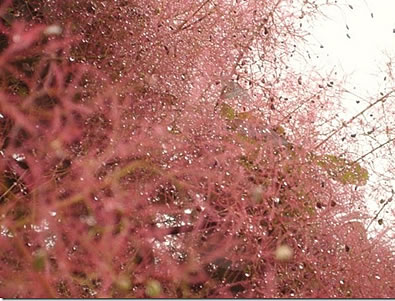
Karyn ... just stumbled across this, as a pink' after thought > the messiness of gender (boxes)with so many of us who resist them and/or aren't a perfect' fit. so totally the opposite of the neatness of the other two ...
*
Dorothee
the 'pink' afterthought image: this reminds me of underwater corals in a stream of water: organic energy reaching out. i tried it, it doesn't really speak to the text on the page.
but while on the page, i had an idea: there's this option to include 2 images in a slide-over-version. so the text is coming in 2 layout versions now, which are both on the same page. [this then turned into the final layout of the pink page]
the two versions, just a move away: for me, this also relates to the second text in the issue, same year, different story: that behind the summary of our years, if we look for it, there also lingers another story.
and the boxes: they also make me think of the black-white squares of the collaboration we once did, and the notes/thoughts it sparked.. now where is that link... here:
the image: The White Squares
+
the
notes on the process
*
afterthought, some days after the launch:
Karyn
i just realized ... the black white black' photo that went up in BPR with the pink diary ... can be witnessed from a different view, with water pouring down, on the BPR blog in image #1: "East Vancouver Detours - Waterfall in the Italian Gardens"
~
back to "pink"
|